Screen Layouts
Every screen must have a Screen layout. It's the Screen layout that controls which layers should be on the screen, their sizes, where they should be positioned and other properties.
Smartsign 10.5 added the possibility to add text layers and create simple interactivity directly in the layout. Each screen layout has a screen layout theme connected to it. The screen layout theme provides various design elements such as colors and similar that can be reused across multiple layouts.
Default screen layouts
There are usually several default layouts available in a new site. By default, starting from version 10.3, these layouts are locked to protect the original layout. In general, you should consider either creating a new layout, selecting one of them as template or making a copy of one of them, rather than editing the original.
Create a new screen layout using an existing as template
-
Deselect all layouts
-
Click +Create new in the action bar
-
Select layout orientation
-
Pick an existing layout to base your new layout on
-
Pick a screen layout theme
-
Input a name for your new layout
-
Click Finish
Copy an existing layout
-
Select the layout that you want to copy
-
Click View in the action bar
-
Click Copy in the action bar
-
Input a name and an optional description for your new layout
-
Click Finish
Unlock a screen layout
-
Select the layout that you want to unlock
-
Click View in the action bar
-
Go to the Advanced tab
-
Toggle the LOCK setting to disabled
-
Click Save in the action bar
Lock a screen layout to prevent editing
-
Select the layout that you want to lock
-
Click View in the action bar
-
Go to the Advanced tab
-
Click the "Lock screen layout" button below the LOCK toggle
-
The layout is locked and saved automatically
Editing screen layouts
Advanced
Width and Height
On the Advanced tab, you should set a target size for the layout. The width and height configured here will be used to calculate the relative size of the layout if it's used on a screen with a different resolution than the target one configured here.
Layout
A screen layout is constructed by adding one or more layers to the screen layout. A layer contains no information concerning size or positioning on the screen. Only once the layer is added to a screen layout, it can be given a size and position in that layout. If they layers is reused, it can have a completely different size and position in another layout.
Controls
Zoom
Controls the zoom level for the layout editor.
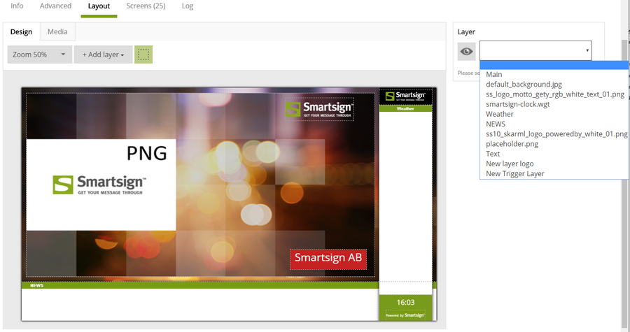
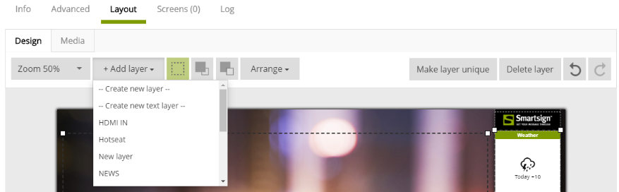
Add layer
Select an already existing layer or create a new regular layer or text
layer.
Show outline
Toggle the outline of layers (dashed line, visual aid).
Move to top
Move the layer to the top, closest to the viewer.
Move to bottom
Move the layer to the bottom, farthest away from the viewer.
Arrange
When you have selected multiple layers, the arrange menu will be
enabled. It allows you to arrange the different layers horizontally or
vertically. For example, select Align left to align the left edge of all
layers to the same position as the currently leftmost one.
Make layer unique
If a shared layer is being used, this will make a unique copy of that
layer. This allows you to perform changes that otherwise might affect
other layouts using that layer.
Delete layer
Remove the selected layer from this layout.
Undo / Redo
Undo / redo the last performed change
Media tab
Add theme logo
Add a layer with the logo from the connected screen layout theme.
Add theme background
Add a layer with the background from the connected screen layout theme.
Add media
Add a layer with media connected, you can upload directly or select from
the media library.

Layer settings
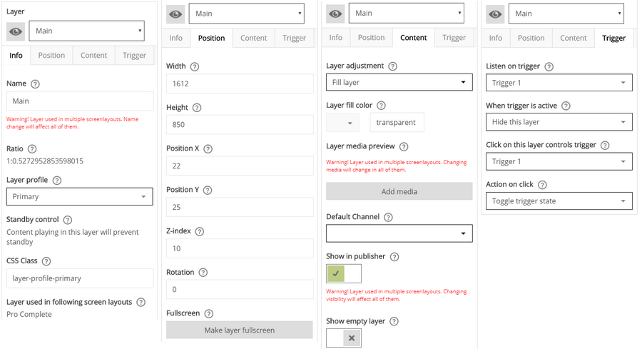
Info
Name
The name of the Layer
Ratio
Shows the calculated width to height ratio for the layer's current
size.
Layer Profile
The layer profile provides information about the purpose of the layer.
For example, if it should be able to wake up a screen from power save.
Depending on the screen layout theme there can also be design elements
added based upon the chosen layer profile, if so the added styles will
show in the CSS class control. The profiles Primary and None are so
called master profiles, that is they will control if a screen should
wake up or go to sleep. The other profiles are not master. That means
they will not be able to wake up a screen by themselves and will only
show if something is booked to a layer using the profile Primary or
None.
Primary – This should be used for the main message on screen. When
content is playing on this layer, the Player will keep the screen awake.
There should only be one primary layer in a screen layout. Primary is a
Master profile.
Dependent – This layer is dependent on the primary layer and will
only play content when there is content scheduled on the primary
layer.
Background – This should be used on the background layer. If there
is no background layer, the Player will create one for you and fill it
with the background color from the screen layout theme. The background
profile is dependent and will only show if there is an active playlist
playing on a master profile layer.
RSS – A layer with this profile should be used for RSS feeds. This
allows Smartsign Publisher to know what the layer is intended for. The
RSS profile is dependent and will only show if there is an active
playlist playing on a master profile layer.
Overlay – Please use the Overlay profile if you want a non-master
layer without any additional design elements added. The Overlay profile
is dependent and will only show if there is an active playlist playing
on a master profile layer.
None – None is a Master profile. It is the only profile except for
Primary that can wake up the screen and keep it awake without depending
on other layers.
Standby control
Provides information about power save/standby control for the selected
layer profile
CSS class
Controls which CSS classes are assigned to this layer. CSS classes are
derived from the screen layout theme assigned to this layout.
Layer used in following screen layouts
Indicates which other screen layouts that share the selected layer.
Certain changes to the layer may also affect those layouts.
Position
Width and height
Width and height of the layer in pixels or percent. Pixels should only be integer numbers without decimals. If you use percentages, you may use decimals as well.
Position X and Y
Position of the layer on the screen in pixels or percent. Starting from the top left corner which is position 0, 0. Pixels should only be integer numbers without decimals. If you use percentages, you may use decimals as well.
Z-index
The Z-Index of this layer. Used by the Screen Layout to order layers on top of each other. A higher Z-index is always on top of a lower one. In other words, the higher the Z-index, the close it is to you.
Rotation
The rotation in degrees for this layer. Rotation of video content is not supported.
Make layer full screen
Click this button to resize the layer so that it covers the entire
layout.

Content
Layer adjustment
Decides how the material should be fitted when displayed on this
layer.
Fit – This is the most common option. This setting will scale the
content as large as possible within the layer, but never distort it. It
will maintain the original aspect ratio of your content at all times.
Stretch – This setting will scale the content so that it fills the layer
completely even if it has to distort the content to do so. The original
aspect ratio is ignored which means content can appear stretched or
compressed.
Layer fill color
The background color of the layer. Should be entered in html/hex-form
(i.e. 000000 for black, ffffff for white). A layer's background color is
used to fill the layer when the displayed content doesn't fill the area.
For example, if you book an image of size 100x50 in a layer of size
100x100 the top and bottom will be filled with the background color. To
not have a background color (i.e. transparent) you should set this value
to "transparent".

Add Media
This allows you to choose a media item from the media library for use directly in the layout. It can be useful as a means of adding fixed graphical elements or default content. If scheduling is allowed on the layer, this content will be overridden if something else I published.
Default Channel
If you configure a default channel for a layer, then the bookings of that channel will show if there are no other bookings active on the screen. See the Channels chapter to learn more about channels.
Show in Publisher
Enable this setting to show the layer in the calendar, thus allowing scheduling on the layer. If this is disabled, the layer will be hidden in the calendar. If you have attached a media item directly to the layer or set a default channel, that media/channel will be replaced if you schedule something on the layer from the calendar.
Show empty layer
Enable this setting to always show this layer, even if there is no
booking. Useful for example if you want to add a fixed colored area.
Trigger
 ..
..
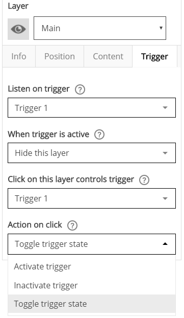
Listen on trigger
Select a predefined trigger that should affect the layer when the
trigger changes.
When trigger is active
Select what should happen when the trigger is activated. The opposite
will happen when the trigger is inactive.
Click on this layer controls trigger
Select a trigger that should change when this layer is clicked or
touched.
Action on click
Select what should happen to the trigger when the layer is clicked or
touched.
Text
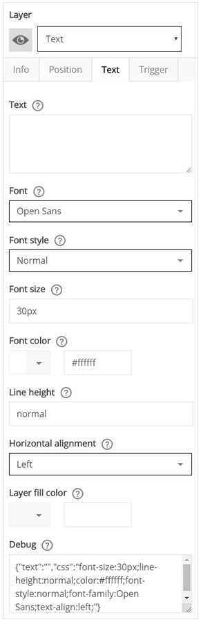
Text
Input the text that should show in this layer.
Font
Select the font to use for text in this layer.
Font style
Select the font style to use for the font.
Font size
Input the font size for this text layer using CSS syntax. We recommend
using pixels, for example 30px.
Font color
Select a color or input using CSS color codes.
Line height
This is the CSS line-height property which specifies the height of a
line of text in this layer.
Horizontal alignment
Select the horizontal alignment of text in this layer.
Layer fill color
Select a color or input using CSS color codes.
Debug
Shows the resulting CSS code. Used for debug purposes.
Effects

Version 10.6 adds some new effects to the screen layout. You can apply
four different effects to layers. Select a layer and go to the Effects
tab to configure. Enable an effect and adjust its properties to your
liking.
The available effects are:
- Rounded corners
- Border
- Drop shadow
- Opacity
* Please note that effects are rendered live on screen and are dependent on browser support and player performance. For this reason, the results may vary.
Rounded corners
Enable to have rounded corners on the selected layer. A setting allows
you control the radius of the corners.

Border
Enable to have a border on the selected layer. Settings allow you to
control the width and the color of the border.

Drop shadow
Enable to have a simple drop shadow on the selected layer. Settings
allow you to control the size and color of the drop shadow.

Opacity
Enable to use opacity for the selected layer. The slider allows you to
control the opacity from 0 to 100 percent opaque/solid. Please note that
some types of content, typically video, cannot support opacity,
depending on both content and player platform.

Layers
Layers are used in Screen Layouts. When booking in Smartsign you are
always choosing one or more layers and those layers can be on one or
more screens.
By adding Groups, you decide who will be able to publish information on this Layer. Layers themselves do not have a size or position until they are added to a Screen Layout.
A single layer can be used in multiple Screen Layouts.Layers can have default size and position which will be used as a template when adding this layer to a new Screen Layout.
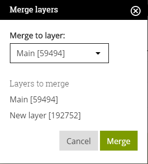
Merging layers
Merging layers is possible from Smartsign 10.6. To do so, use Ctrl-click
to select the layers that you want to merge. Then click Merge in the
action bar. A dialog will appear. Select the layer that you want to
merge the other layers into. The other layers will be merged into that
layer. Any layout using the merged layers will be updated and any
bookings on those layers will be moved to the destination layer. Please
take care when merging layers. It's not possible to undo a merge.
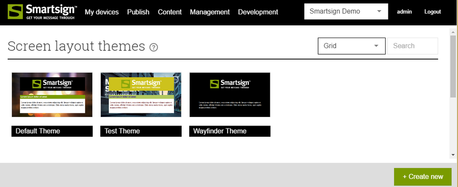
Screen Layout Themes
A screen layout theme is a unified set of designs elements and color schemes that you apply to screen layouts to give them a consistent and attractive appearance. Using a theme is a quick and easy way to add interest to layouts and give them a professional look. You can select any default theme or create your own theme.
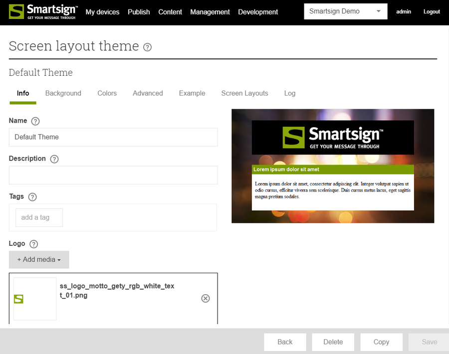
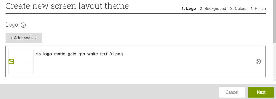
Creating a Theme
Logo
Add your company's logo so that it can be used in screen layouts.
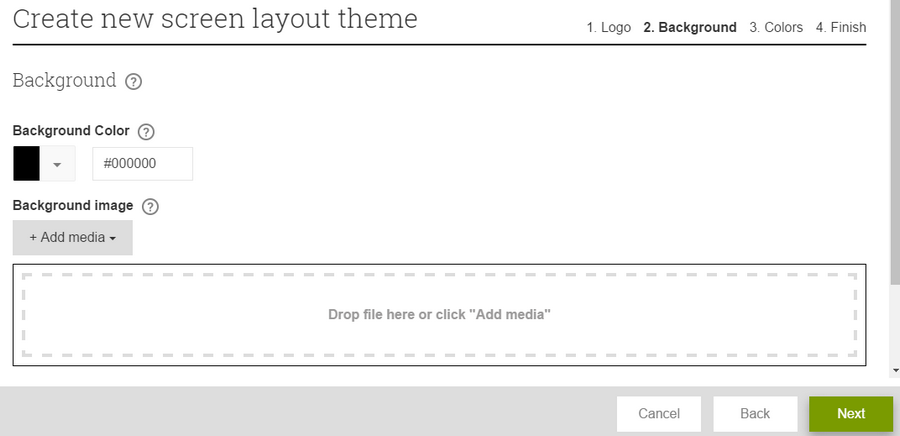
Background Color and Image
Add a color of your choice and a background image.
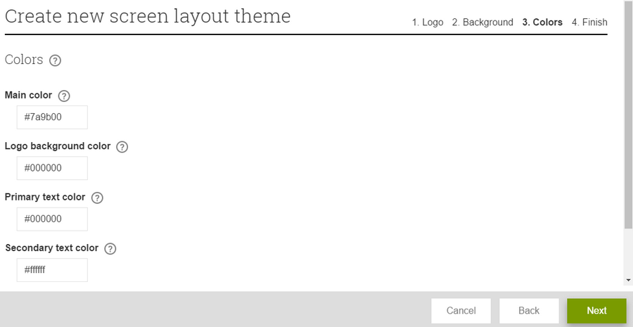
Colors
Define additional colors for use in text, banners, widgets etc.
Triggers
Triggers can be used to change the player behavior in response to
events.
When a trigger is activated on a player it affects the layout and thus
the playback of content on the player.
A trigger can either show or hide a single or multiple layers on the
screen. The layout and playlists of these layers determine what will be
displayed when a trigger is active or inactive.
All triggers must be defined on the server first. Once you have defined
a trigger you can use it in a screen layout to hide or show layers when
the trigger is activated.
Activating a trigger can be done in multiple ways:
| Method | Locality | Typical Response Time @ Player | Comments |
|---|---|---|---|
| Publisher | Server | 1 second | Response time is dependent on player type and server settings |
| Remote Control App | Server | 1 second | Response time is dependent on player type and server settings |
| Layer trigger action | Local | 0-1 seconds | Connect trigger action to layer in layout, triggered on touching/clicking the layer(From Smartsign 10.5) |
| Template trigger action | Local | 0-1 seconds | Connect trigger action to layer in template, triggered on touching/clicking the layer (From Smartsign 10.6) |
| Widget API | Local | 0-1 seconds | setTrigger("Trigger name", true or false) |
| Keyboard | Local | 0-1 seconds | PC Player only |
| Webhook | Server | 1 second | Response time is dependent on player type and server settings (From Smartsign 10.7) |
Triggers activated locally on the player will affect the player
immediately. They will only affect the local player. Please note that to
use a trigger you may need to have several security access rights. You
need access to the trigger itself as well as any screen, layer and
channel that it should affect.
Create a trigger
Info
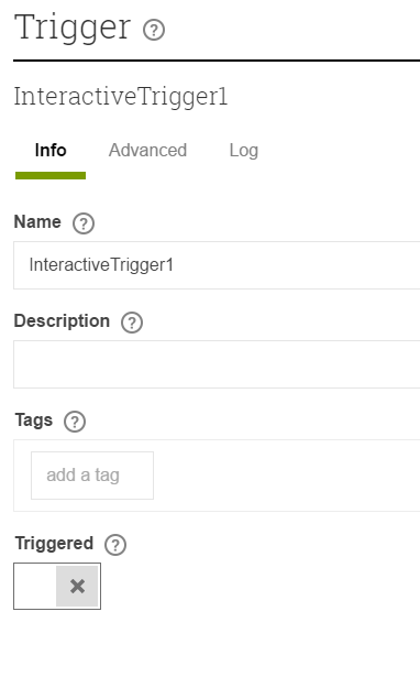
Name and description
Name is used to identify the trigger and description can be used for
your personal notes.
Triggered
This determines the default state of the trigger. If it's set to
triggered, the trigger will be active by default.
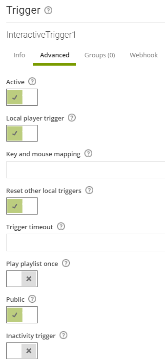
Advanced
Active
Determines if the trigger is active = available, or inactive = disabled
Local player trigger
Determines if it should be possible to change the state of the trigger
locally on the player
Key and mouse mapping
If you want the trigger to react to a key press on a keyboard, you can
input that character in the field "Key and Mouse Mapping". If you want
to use several characters you use a space between them. For example, to
trigger on someone pressing the 'T'-button regardless of small or
capital letters, you would put "t T" in the field.
Toggle trigger on keypress
If this setting is enabled the trigger will toggle between
active/inactive for each press of the mapped keys. If disabled it will
only activated on keypress.
Reset other local triggers
If this setting is enabled the player will reset all other local
triggers when this trigger is activated.
Trigger timeout
Configure a timeout for the trigger by entering a time period here. Once
the trigger is activated, it will return to inactive after the
configured time. Input as a string using 'ms' for milliseconds, 's' for
seconds and 'm' for minutes. For example, both '60s' and '1m' represents
1 minute. You can also combine, for example '90s' equals '1m 30s'.
Cannot be combined with "play playlist once".
Play playlist once
Enable this to only play the playlist once when the trigger is
activated. After the playlist has completed playing, it will stop, and
the trigger will be deactivated. The playlist may consist of one or more
bookings, ie the player will play until it's time to loop the playlist
and then stop. The trigger is deactivated locally on the player so it's
now possible to activate the trigger again to play the playlist once
more.
Public
Makes trigger public and enables the use of webhooks.
Inactivity trigger
Supported on Android Player 10.20.12+ and Windows Player 10.24.5.8+.
Enable to activate the trigger when the screen has been idle for a
specified amount of time. Time is specified using the 'Trigger timeout'
setting. Since an inactivity trigger is controlled by an external state,
the "Triggered" setting should be set to False.
Script
It's possible to attach a JavaScript directly to the trigger. This is an
advanced developer topic and has seen limited testing so far. You should
not attempt to use this unless you are programmer with sufficient
knowledge.
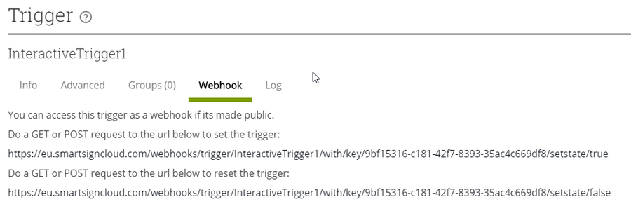
Trigger webhooks
Smartsign 10.7 adds webhooks for triggers. To use the webhooks you must first set the trigger to be public. To do so, just enable "Public" on either the Advanced or the Webhook tab when editing a trigger. Once the trigger is made public, the webhooks are ready to be used. Anyone with access to the webhook URLs can now control the trigger so be careful who you share it to! If you know the URL is compromised, delete the trigger and create a new trigger with the same name. This will give you a new key so the old URL will no longer work. You do not need to be logged in to Smartsign to access the URL. Simply do a GET or POST request to it. For example, from the web browser, Putty, Postman or a web service like IFTTT.
If the request is successful, the server will respond with a json message:
"{\r\n \@odata.context\:\http://localtest.me/api/$metadata#Edm.String","value":"Trigger set\\r\n}"
The webhook URLs follow this pattern:
http(s)://<server>/webhooks/trigger/<triggerName>/with/key/<key>/setstate/<state>
By using webservices like IFTTT you can react on different actions like
emails, weather conditions or even voice command on Google Home. Note
that your server must be reachable by the web service which may not be
the case if you have an on premise Smartsign installation.